Set the Stage for Your Campaign with a Background Twibbon
When to use a Background Twibbon instead of a Frame, and the one-minute test that keeps your design readable

Scroll the supporters gallery on Market Day MIMA Babakan Loa and you do not find hundreds of people in framed portraits. You find them in the middle of vendors selling all kinds of food.
The campaign belongs to the Islamic elementary school Muhammadiyah in West Java, Indonesia. The design is an illustration: clear blue sky filling the canvas, two stalls on two corners, and various foods adorning the left and right sides of the frame. A supporter uploads a photo, and they land in front of the market. That is a Background Twibbon, and most creators never try one.
Background goes behind
A Frame goes around the photo of your supporter. The center is transparent, so their face will instead be the center. When you design a frame, you think of a border. This is the default on Twibbonize, and it is the right call most of the time.
A Background, as you might guess, goes behind your supporter's photo. And when you design the Twibbon, you have to think of the entire canvas, because the goal is to foreground a person in a world you built.
Think of it like this: A Frame decorates your supporter, while a Background relocates them.
That difference tells you when to reach for it. Frames work when the person is the point: causes, achievements, pledges, professional badges. Backgrounds, on the other hand, work when the place or the moment carries as much weight as the person. Like Twibbons for events, fandoms, and national celebrations. Something for when the location takes part in stating "I am a part of this".
The canvas size matters
Because a Background fills the whole canvas, you should not think of the size as a mere technical detail. The size will determine how much of your world people see. Here are six live campaigns, grouped by the size their creators chose, and how each of them works.
Square, 1:1
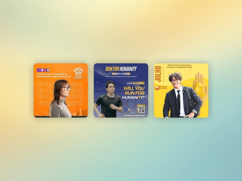
From left to right: #VAWFREEPH2025, Run For Humanity, Julho Amarelo 2026's campaign campaigns
#VAWFREEPH2025 and Run For Humanity both went square for each of their occasions. The campaign by the Philippine Commission for Women takes the approach of treating the frame as a virtual backdrop. Similarly, Julho Amarelo 2026's campaign functions as a backdrop for its supporters. But instead of having people standing in front of the tagline, it opted for yellow ribbon, in support of combating Hepatitis Viral. Sab Sandoval's PMAP community run sets the campaign on a running track, containing a date, a venue, two hashtags and a registration QR code into the same square for a September event in Pasig City.
Square is the safest place to start with a Background. It goes on a feed post, a Story, and a profile picture. Acceptable everywhere.
Feed portrait, 4:5 and 3:4
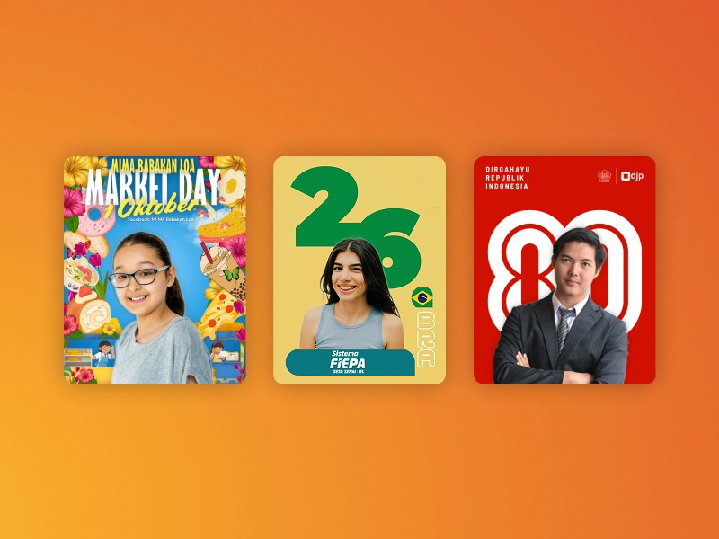
From left to right: Market Day MIMA Babakan Loa, Sistema FIEPA, HUT 80 RI campaigns
Three went vertical. Market Day MIMA Babakan Loa uses 4:5, to fit the market illustration along with the campaign name slotted at the top. Indonesia's tax directorate did the same for the upcoming Independence day, HUT 80 RI, placing supporters in front of the giant white-and-red "80". Sistema FIEPA went taller, close to 3:4, for its Brazil World Cup campaign: yellow field, green "26", federation mark on a teal pill at the base.
Vertical buys room. The extra height is where the world goes, above the head and below the shoulders. It takes more space in a feed than a square does, but these sizes have become more of a standard compared to 1:1.
Full screen, 9:16
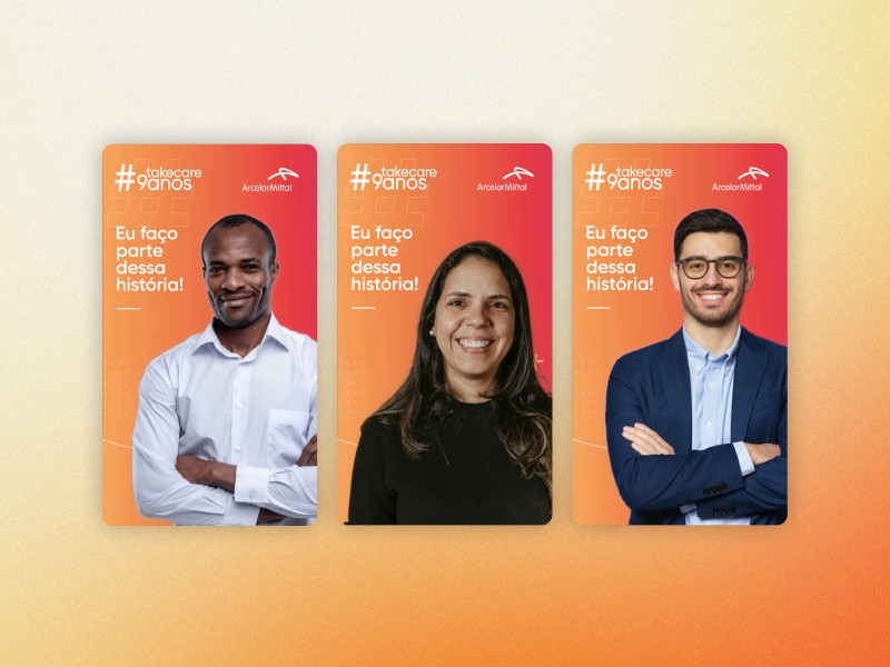
Take Care: 9 anos (9:16) campaign
ArcelorMittal's Take Care: 9 anos went all the way, a 1080 x 1920 gradient built for Stories, or Snapgrams, so no floating picture in a letterboxed box. They also uploaded a 1:1 version, letting supporters pick the shape that matches how they share.
Pro tip: releasing your campaign in various aspect ratios means your supporters can share it either as a feed post and a Story, or both, neatly.
What separates the good ones
Don't do this | Do this instead |
|---|---|
Campaign name in small type across the center, where the supporter will stand | Name banked into the top or bottom strip, clear of the body |
A busy photographic backdrop competing with a real face | Flat color, illustration, or gradient that represents your campaign |
Square by default because it feels safe | The size that matches where your people actually post |
A dark design that swallows skin tones | Enough contrast that the person separates from what is behind them |
The middle-third test
Backgrounds can fail in one specific way. The creator puts something important exactly where the supporter is about to stand.
Draw an imaginary band across the middle third of your design and list everything inside it. If your campaign name, the year, or your logo is on that list, move it out.
The middle third belongs to the supporter. Everything that identifies the campaign belongs above or below it.
Look at the six campaigns again and notice they all pass. Save The Ocean's title sits top right. FIEPA's mark sits at the base. The tax directorate's "Dirgahayu Republik Indonesia" and both logos sit in the top strip.
One exception is worth knowing. Large graphic shapes can live in the middle, because they survive being partly covered. That white "80" still reads as 80 with a person in front of it. Small text does not survive the same treatment. Shapes can be interrupted. Words cannot.
A Frame puts a border around them. A Background puts them somewhere. If your next campaign is an event, a celebration, or anything where their participation is a highlight, then you can build a stage for the campaign, leave the middle-third clear, so your supporters can be the star.