Fourteen Indonesian Independence Campaigns For Your Inspiration
Independence Day campaigns you can join or use as inspiration to run your own this August 17

The following preschool in Surabaya, the tax office, an airline, a sovereign wealth fund and a neighborhood community in Magelang all created a Twibbon to celebrate Indonesia's Independence Day.
Red and white is the baseline for an August 17 campaign. Everyone uses it, and may even grow bored of it. So how do you make a campaign that stands out? What fills a gallery is the accent: one element telling a supporter this campaign was made for them and not for everyone else celebrating the same day.
Here are our curation of campaigns, grouped by who they were built for. Join the ones that are yours. Reference the ones that are not.
Sits there | Gets shared |
|---|---|
Red, white, the official 81 logo, "DIRGAHAYU REPUBLIK INDONESIA" | Red, white, and one thing only your people would recognize |
1. Centered to children and teens
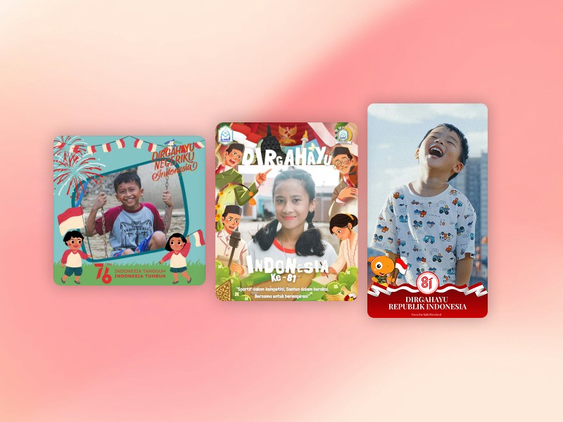
From left to right: HUT RI 76 Tahun Anak Indonesia, Dirgahayu RI 81, DIRGAHAYU REPUBLIK INDONESIA KE-81
These three belong to specific schools. If you run a school, this is the easiest campaign on the calendar, as you already have a sure crowd who will join. But what makes these campaigns special is they do not rely only on the red and white colors but add their own flairs to each campaign: illustrations of children having fun carrying flags, the national heroes, and the school's mascot.
2. For professional and hobby communities
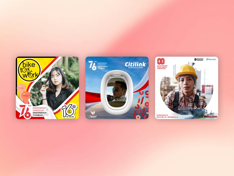
From left to right: BIKE TO WORK HUT RI KE 76, Twibbon Citilink HUT RI ke-76,HUT RI 80 - Pelindo
Citilink made the frame a cabin window, so the supporter sits in the porthole with the sky outside. Pelindo added cargo ships to theirs. Bike to Work set the club's own 16-year badge beside the national one, which turns the campaign into a claim about the commute rather than the holiday. A community-specific celebration is one way to get your supporters' hearts.
3. Showing Indonesia's diversity
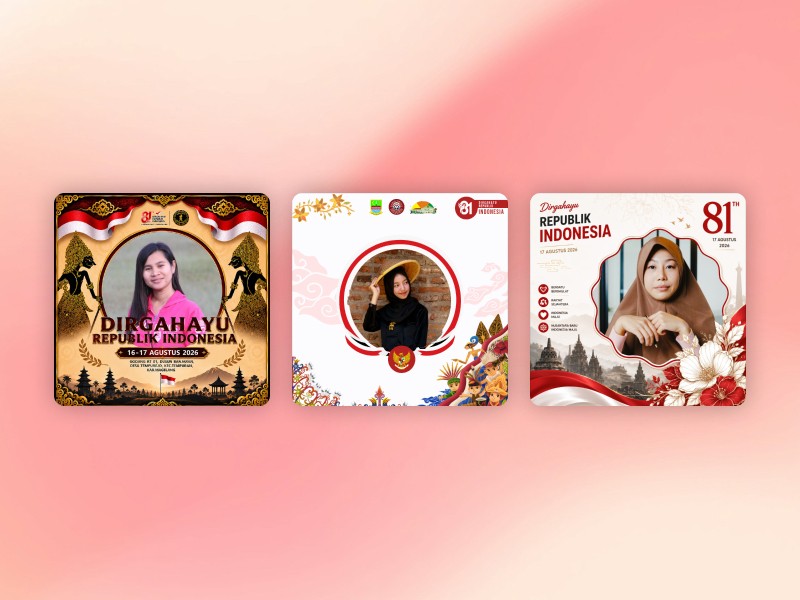
From left to right: DIRGAHAYU 1945, Gebyar Kemerdekaan RI Ke-81 RT 005/02, Dirgahayu Republik Indonesia ke-81
DIRGAHAYU 1945 builds its frame around wayang figures in a single monochrome gold, Gebyar Kemerdekaan RI Ke-81 RT 005/02 layers Megamendung batik behind a crowd in traditional dress from across the regions, and Dirgahayu Republik Indonesia ke-81 sets its photo window against Prambanan. None of the three leans on red and white to say Indonesia, which is what makes them the sharpest contrast to the institutional campaigns further down this list.
4. Institutional, but clean and recognizable
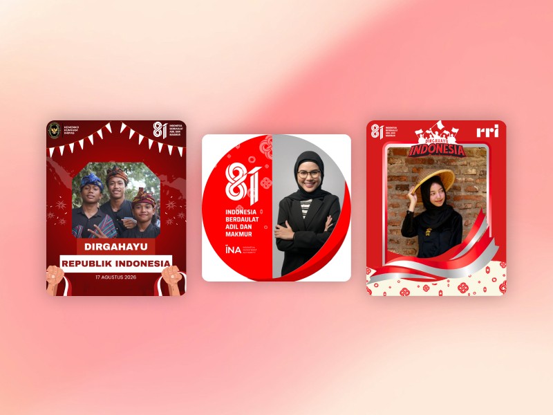
From left to right: Dirgahayu Republik Indonesia, Hut Kemerdekaan RI 81 - INA Ver 03, HUT RI ke-81
These five are the cleanest campaigns on the list. No illustration, no crowd, no batik, and enough empty space that the face is the only busy thing in the picture. That restraint is what makes them work in a professional feed, where a staff member is posting to colleagues, clients and their own LinkedIn network on the same morning.
5. More red and white, but still distinctive

From left to right: DIRGAHAYU REPUBLIK INDONESIA, Hut RI Spring
Both of these start from the flag and add exactly one more element. GPIB flanks its frame with a gapura, ceremonial gates built across neighborhood streets usually in August. A national symbol rendered as an object close to the people. Cluster Grand Batavia rings its photo window with pastel creatures in peci and headbands holding flags and bamboo spears. Cute is a real strategy for neighbors you know rather than strangers. Take this pair as proof that small communities do not need to look official to fill a gallery.
Red and white sets the date. One specific thing sets the people, which could be a school motto, cabin window, gapura, or an address. Find the campaign that is already yours and join it.
If nobody has made it yet for your community, that only means an opportunity for you to create one!
You have eleven days. So, chop-chop!