Three Things to Make Your School and College Twibbon Designs Stand Out
It’s almost that time of the year, schools and colleges will begin a new semester, and you can make it more fun

Before opening a design tool, answer one question: What does your program, club, or event stand for? What colors, symbols, or language live in its world? Start there.
Here are some campaigns on Twibbonize that might help you arrive at your answers.
1. Design based on your program's identity
The most shareable school Twibbons feel like they belong to a specific place. Not just "a university" or "a school." Rather, This department, this batch, this event.

The Junior Economics Society at Gingoog City United Colleges titled their campaign "Shaping Minds, Building Economies, Transforming Communities". That is their program's mission, rendered as a campaign identity. When a student joins, it becomes a commitment to maintaining this mission.
That specificity is what makes a design worth sharing. A frame that says "BA Economics, GCUC" frankly invokes nothing other than, “Oh, you got accepted there”.
A frame built around the department's actual reason for existing, however, is a badge of honor. Your campaign can also inspire a sense of belonging to that particular mission, not just another moment of badge-wearing that repeats every wear.
2. Let the subject matter inspire the visuals
The successful school campaign designs borrow directly from the course content, the event theme, or the club purpose.
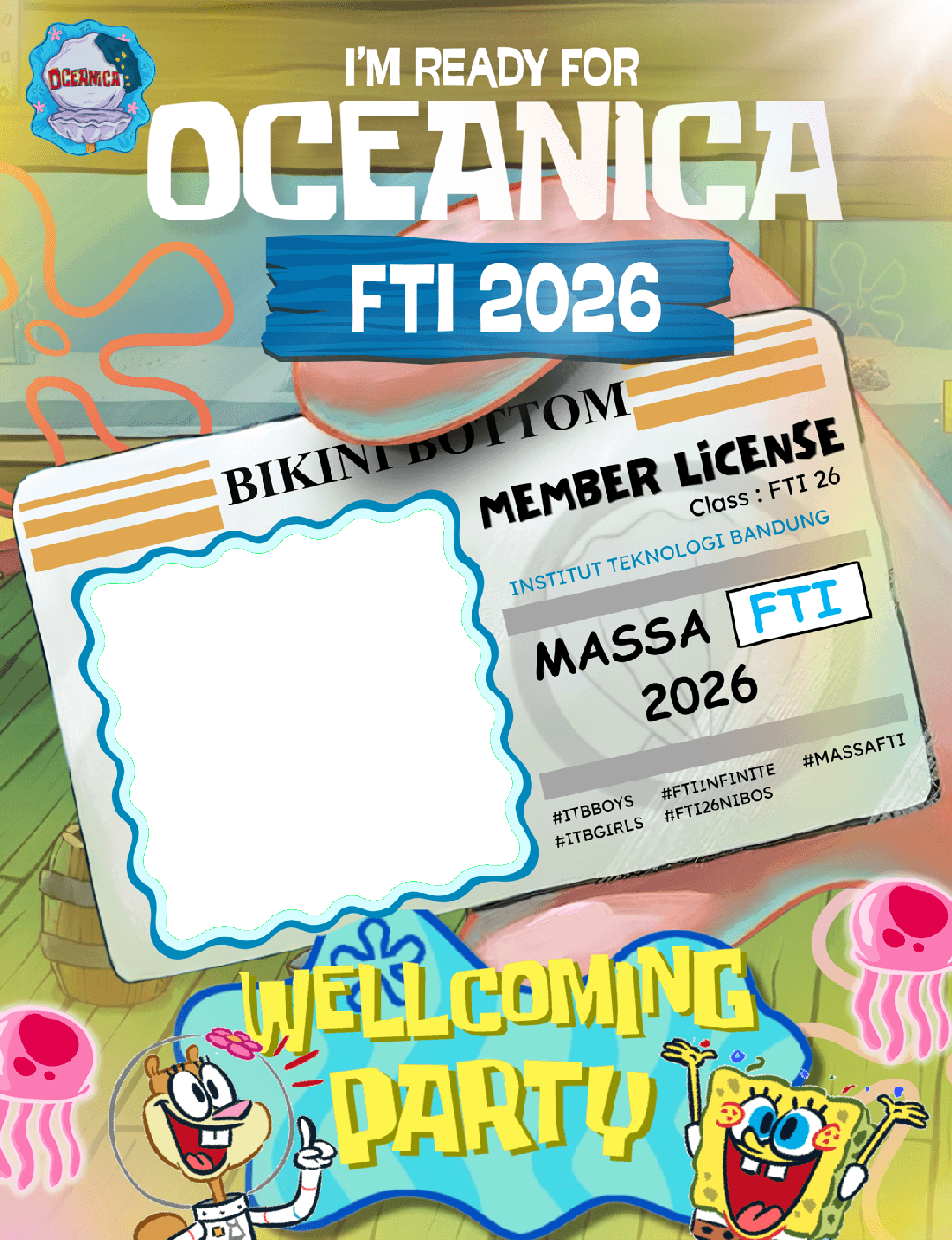
We were especially fascinated by the 2026 batch of Faculty of Industrial Technology of Institut Teknologi Bandung; we immediately knew what the reference was. They created the twibbon as part of the orientation program for freshmen. They already came up with the theme “Oceanica”, giving way to Spongebob-inspired twibbon.
The blend of child-like design and the name of the institution signals a fun program, nothing to be afraid of. A true welcome for the recently graduated high school students.
Another approach is by the School of Criminology and Justice of the Holy Cross College, Inc.

On the surface it works on the same principle: they have a strong concept that becomes a foundation for the visual. But for this campaign, they lean into the theme of their study. “Future Law Enforcer” statement, the balance, and newspapers on the background signal, “we have a responsibility to uphold the name of this institution.”
This proves that a strong concept needs a logical background. If you see a self-proclaimed law enforcer wearing cartoon characters on their twibbon, you might doubt their capacity, wouldn’t you?
3. Write a description that tells people why this campaign exists
Look at two descriptions from campaigns launched on the same week below:
Campaign | Description |
|---|---|
"Show your support!" | |
"Show your pride and solidarity with the Bachelor of Arts in Economics family by using our official DP Blast frame. Let us stand together and represent our program with confidence, excellence, and purpose as we begin another academic year at GCUC." |
The first, while we do love the design, tells a visitor nothing. A first-year student who clicked a link from a classmate's Story and has never heard of "CTED" has no reason to care, let alone to join.
The second, on the other hand, makes its purpose clear. It names the community and frames joining as an act of belonging.
Why does this matter? We can see that the second one by the Junior Economics Society has a filled up gallery and garnered double the supporters compared to the first campaign.
Your description is the only thing standing between a curious visitor and a supporter. Most school campaigns assume everyone who arrives already knows what the campaign is about.
But why not include other people who would encounter that profile and campaign page, too? A clear description and name will only increase exposure to your campaign.
Prop tip: The second campaign also answers these three questions before any visitor has to ask them: What is this? Who is it for? Why should I join?
The design, the description, and the name are what make the difference between a campaign that fills a gallery and one that sits at less than forty supporters all semester.
Create a visual campaign that works with Twibbonize.